Showing posts with label blue. Show all posts

On a Blue Streak


*Note to reader: This post was written after ingesting Alkaseltzer Plus Night Cold Formula. I had good CLEAR intentions before starting, but it hijacked my brain and made me a bit rambly.  (But I FEEL great!) Sorry, I really like blue lacquer. Also, spell check wouldn't work... of all days!

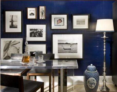
While browsing through the lovely images on Jennifer Robertson's new blog Belclair House I spied this image...


Actually my peepers went right to this part...
Oh those walls! Show me more!!!! I haven't bought the latest Veranda and I'd love to know if they do. I'd buy it for sure.
This got me spinning on blue lacquered walls again.  I love /want the look, and it is so hard to achieve because it shows every imperfection in the wall.  I don't mind them if its an old house, its actually adds character, but when its newer contruction there really is no excuse.  So this brings me to wallpaper.  I was just looking through Phillip Jefferies Sourcebook the other night and was admiring their lacquered offerings. It's definitely is a bit more forgiving than paint.  The navy immediately had me drooling, and then I saw their lacquered strie wallpaper. To die for! Just take a look...

And here it used by Bradley Stephens in the gameroom of Hampton 2010 Designer Showhouse...


 I am really enjoying the color combo and that rug!

And for all you Chanel fans, they make a quilted lacquered paper...

see more colors here. Oh, so many good choices.


So I leave you with some eye candy.
For those of you smooth and shiny purists check out Sketch 42's post filled with lots of blue glossy goodness here.

And for the straight up blue lovers you MUST check out Jennifer's blog here...


Back and Blue

Hello there! I've missed you all! Yes, I fell off the blog wagon, and I have been trying to get my mojo back.  Kids, mopping my floors, running... I have lots of excuses. Oh, update... I did do my first half marathon way back in November and 1. I FINISHED IT, in 2:22 no less (beat my goal of 2:30) and 2. it has completely shattered so many limiting beliefs I have held.  You really can do anything you set your mind to, corny but true.  So in that respect...blogging is like exercise, the more you do it the easier it gets.  And we all know what happens when you skip a week, or month.  Getting back in the habit is almost painful.  Enough " isms." So here I go...

OK, I fell in love with David Collin's Bangkok apartment when I was flipping through an issue of the Aussie mag Belle this past September. (See, I even had the material to post. Shame on me.)  I just came across it again today when I was doing some clean out of the massive  magazine stacks next to my bed and all around my living room. (Mom, I inherited your hoarding of magazines gene. Thanks.)  Check it out...


 And some more of his work...


 I have long been a fan of blues, and Mr. Collins does blue SO well. I love how he frequently adds purplish-pinks... I am currently doing my bedroom over in blue and this just confirms my want to add magenta.


Check out more of his lovely work here.


What I'm Obsessing Over Today

I think I could use this title weekly.
Oh wait, I'm only posting like once a week anyway.  Getting back on the horse is tough!  OK, enough whining... so while at this week's trip to the Boston Design Center I found myself entranced
with these Vaughan lamps at Webster & Co.
The lamps are great, but the blue shades are what make them killer.
 See below...

Boring but practical white shade. They almost look like they are naked!  "Hello tighty whities."

Now I could digress on the magic of a colored or patterned lampshade and go into photo montage land, but its been done many times and much better than I could do at this hour. Instead I'm going to babble a bit about how much I am in love with this shade of blue.  Mid toned, not nearly navy, not too baby blue, a touch of periwinkle, but not too much to make it cute.  Love it.  I found a bunch of displays that day using it, Ralph Lauren's was stunning with lots of black and white, but my picture is so blurred.  Kravet had this going on...

A little deeper, more predictable, crisp and clean nautical. 
So now I am smitten with yet another color, trying to figure out in all my spare time how to incorporate it into my life with out having to completely redecorate.  I'm sure by the time I do I will have found a new color to lust over.

LinkWithin

Related Posts with Thumbnails